How do three employees create the hottest new food brand in Detroit, while also transforming the neighborhood in which they grew up? Detroit Dough is how.
Problem/Solution
As the brand’s delivery of their product shifted from pop-ups in the company’s early months to distribution deals with various retailers, the messaging, tone of manner, and overall design direction evolved with it. The result was cemented in a “less is more” brand strategy in which simplifed graphic elements were worked into a variety of touchpoints in a uniquely, Detroit Dough way.
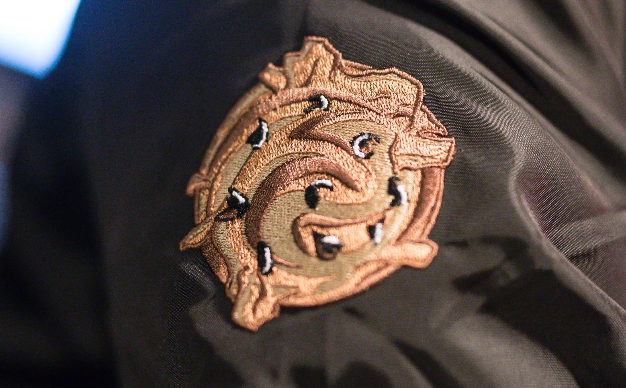
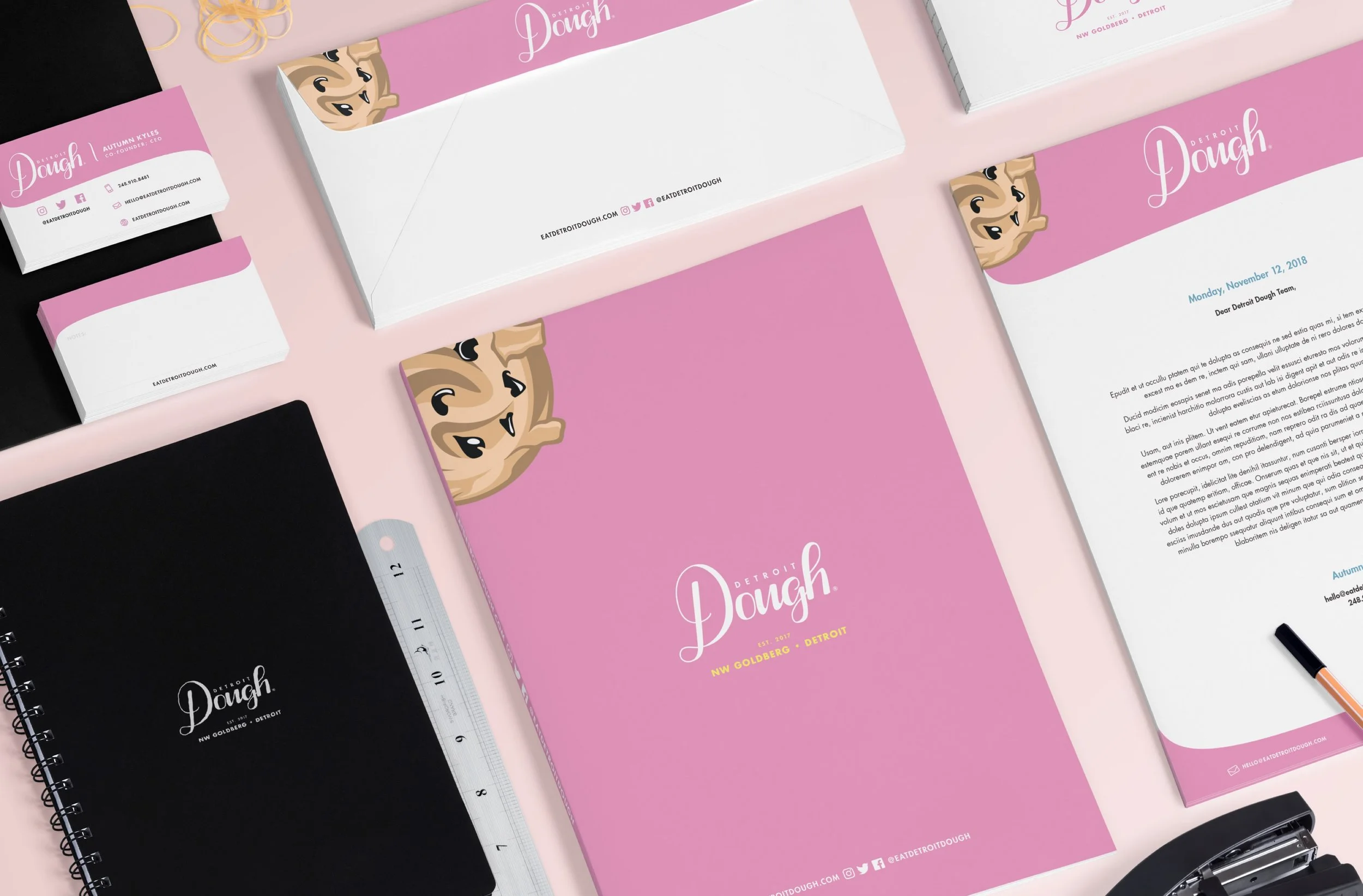
The brand was not only refreshed, but extended from the identity components to packaging and promotional items in manner that was as unique as their unconventionally delicious as their ready-to-eat cookie dough. While the wordmark was crafted by another designer unrelated to DM design, the playful cookie dough illustrations were our distinct addition to their identity system, executed in a manner that would complement the hand drawn “Dough” type in the wordmark .
Identity Components
Packaging
Before developing their current packaging system, Detroit Dough were using white, 6 oz. cups printed with the wordmark and a previously illustrated "cookie dough icon" by their former designer for each flavor. However, they soon realized a problem with this solution based on overwhelming consumer feedback. Most people believed the icon resembled an “ice cream scoop”, which resulted in tasking them to constantly clarify to consumers they sell edible cookie dough.
We provided branded elements and design that effectively communicates to the 24-36 year old women demographic. The use of bright, feminine colors and graphic elements was designed in a way that would excite consumers to not only purchase it, but to become passionate, brand ambassadors on social media platforms. The final design solutions for the cups can be seen below for their 6 oz. and 4 oz. serving sizes.
advertisements
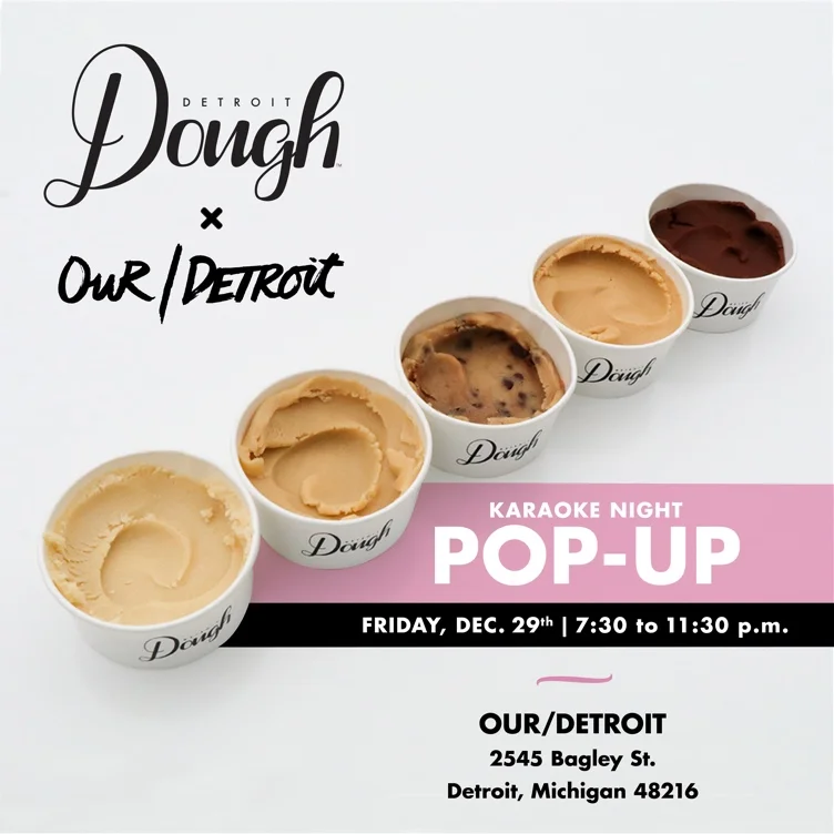
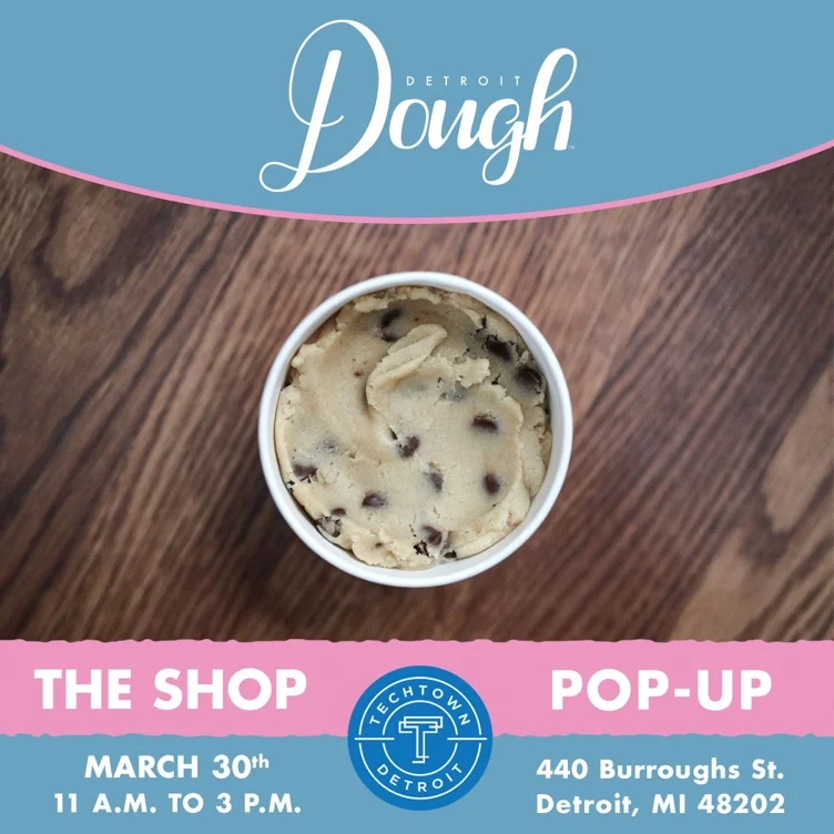
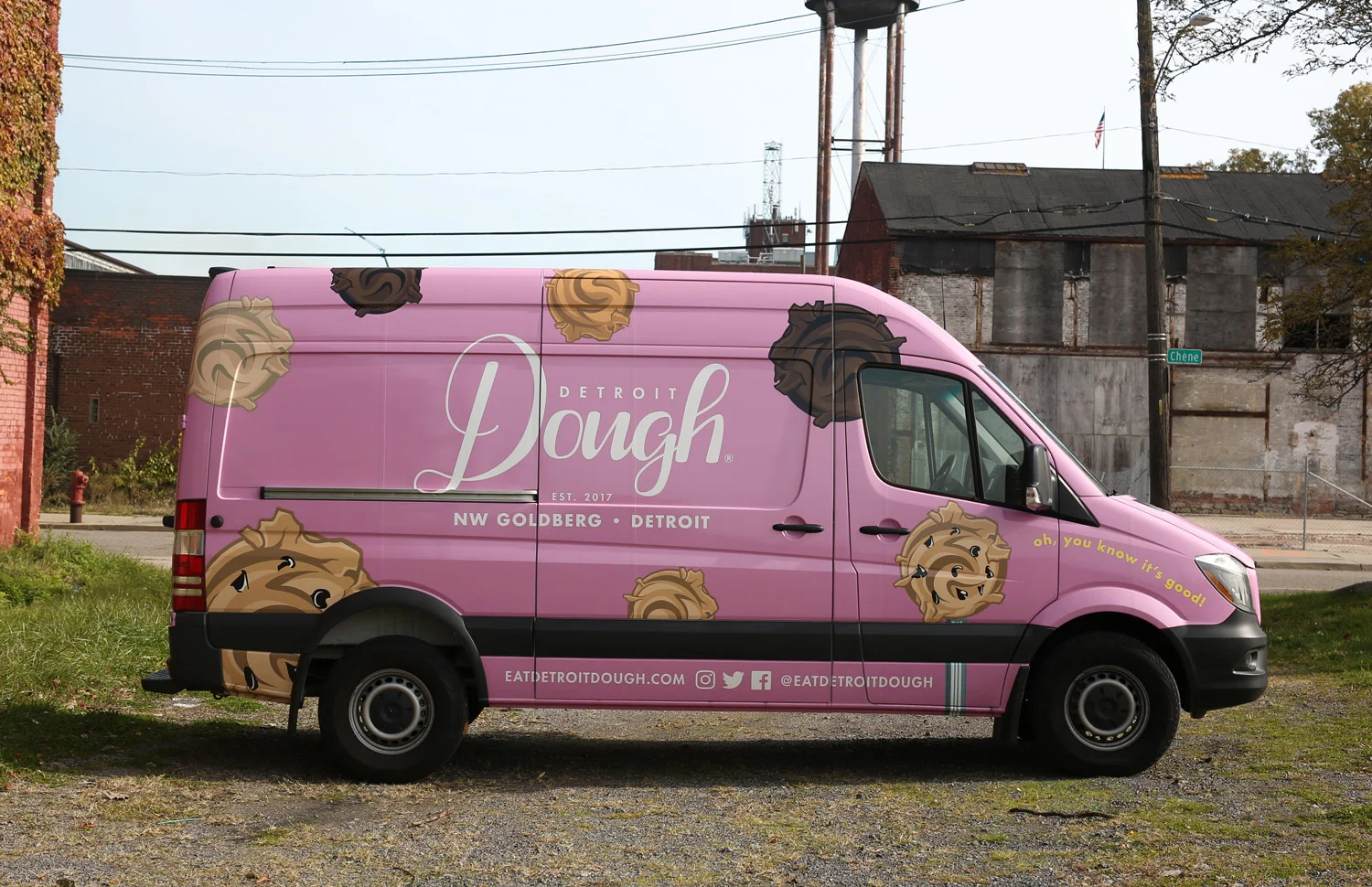
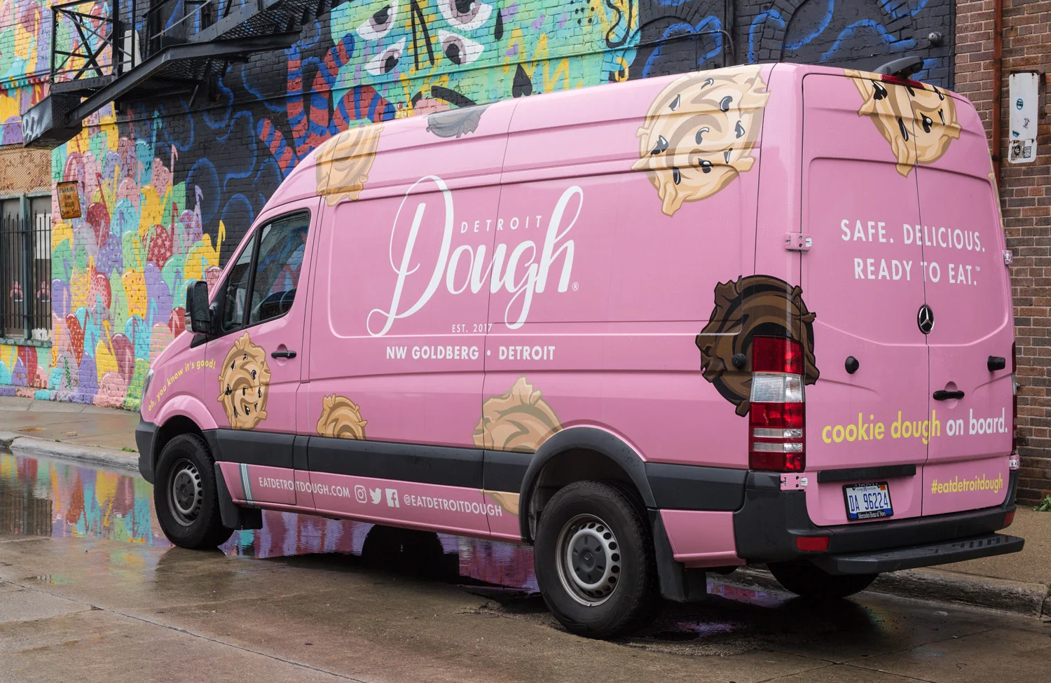
Detroit Dough’s signature pink can’t be missed. Using it as a fullbleed backdrop for advertisements has been very effective in reinforcing it as the primary color consumers associate their brand with. By pairing it with the five flavor cookie dough illustrations to enhance the playfulness and memorability, we established an iconic brand look. Secondary colors such as their signature blue and yellow to shape calls to action and redirect attention to important elements or messages.
Short, snarky phrases such as “oh, you know its good!” and “cookie dough on board” were incoporated into the sprinter wrap design to reinforce their confidence in the deliciousness of their product. The most important underlying thread betweeen the brand language and the visual execution is an emphasis on direct, simplified style that feels professional, contemporary and it's resounding success have been proven in Detroit Dough's sales.
Business System
Website
Detroit Dough needed a solution that would accommodate two primary user groups — consumers and distributors. Our wireframing process led us a brochure style website that enabled consumers to see what venues carry their dough and a multi-page About Us section that explained their incredible brand story in a way that distributors know they are the real deal.
User engagement came in the form of bright calls-to-action and playful animations that establish a nostalgic/fun vibe to in an effort to take the user back to a simpler time, sneaking cookie dough out of a bowl as a child. However, a contemporary minimalist style was agreed upon to appeal primarily to millennial women with a bold, bright color scheme and pictures of their brand presence at sporting events, colleges and movie theaters.
Client
Detroit Dough
Our Role
Branding & design, digital experience, illustration, packaging, advertising
Detroit Dough is a safe-to-eat, cookie dough manufacturer established in the neighborhood of NW Goldberg, Detroit. Cups of their product can be found in various entertainment and sport venues throughout Michigan.

